 |
| Pandora's Box, a metaphor for 2020: Pandora opened the box. Immediately the impatient Troubles flew out and spread to the far corners of the Earth, only timid Vaccine, err, Hope remained. Or something like that. |
|
| Pandora's Box, a metaphor for 2020: Pandora opened the box. Immediately the impatient Troubles flew out and spread to the far corners of the Earth, only timid Vaccine, err, Hope remained. Or something like that. |
My college degree says I'm an electrical engineer. It does so because Carnegie Mellon University back then had a great graduate Computer Science department but no undergrad CS or software engineering program. (Heck, I never heard the latter term until I left CMU!)
However, EEs become very fond of exponential growth and decay, as do biologists, ecologists, and epidemiologists. On the other hand, journalists throw around the term with great abandon and really don't understand what it is.
I've also been interested in the 1918 "Spanish" influenza pandemic ever since I heard Allistair Cooke describe it before the relevant episode of Upstairs, Downstairs. It wasn't until I read more about it during a new pandemic that it appears to have gotten its start in pig farms in Kansas, evoloved to a much more virulent strain in Europe during World War I and came back to the US and wrought devastation throughout the country, including places in Massachusetts I was familiar with but never knew that part of their history.
When the first inklings of a "novel coronavirus" came from Wuhan, China, I immediately started following it there, wondering when it would reach the US. It did as a new, more infectious strain that entered Italy and Washington State. From Italy it came to several places near the Atlantic coast, from Hanover NH (near me!) to New York City (mass transit!) and beyond.
I and others looked at those outbreaks and were alarmed to see true exponential growth of 34-35% per day for a few weeks. That's a doubling time of just 2.3 days. A tenfold increase in a week. 10,000 in a month. I concluded there was no way to avoid it, so I started cooking dinners that would have a lot of leftovers in order to spend two weeks at home if necessary. To this day one of my favorite Covid web sites, 91-divoc.com, has reference lines for 35% growth.
Fortunately, that rate persisted for only three weeks. Some of it was due to ramped up testing, some to the suite of lockdowns, social distancing, and masks and everyone was able to "flatten the curve" and things were looking pretty good by the end of June in most places. Then came a summer surge in parts of the country, and then with cooler, drier weather in November, a new surge, augmented by Thanksgiving and Christmas, and rationing of hospital care is underway.
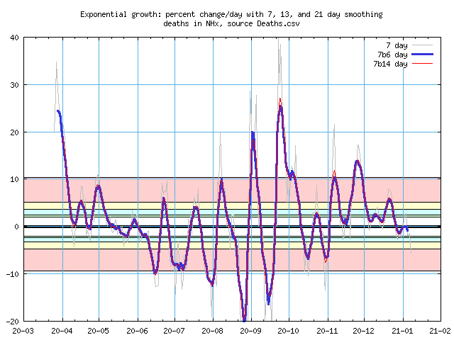
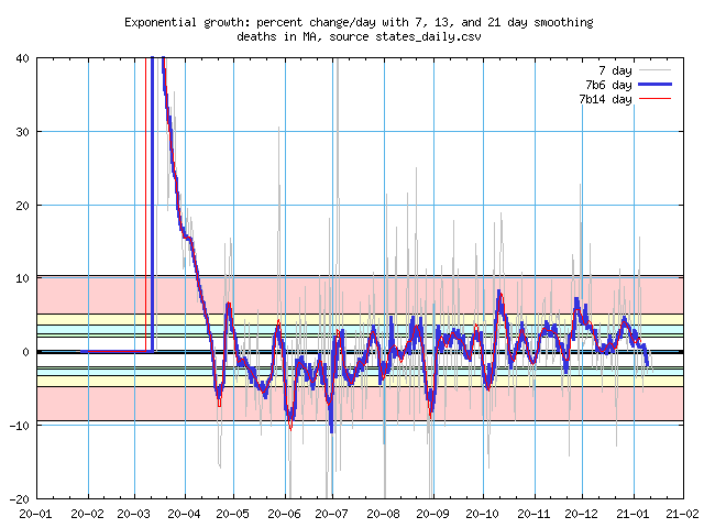
I'm still interested in the exponential growth and decay, it's easy to compute. While the Divoc site has some of that information, it's a bit piecemeal and at current levels under 5% per day, the noise outweighs the signal. The October/November surge finally convinced me to write a program to take raw data and plot the growth rates for various states and countries. Some of the places that interest me are below, I'll add to it over time, or maybe wind up with data for all 50 states and a fair number of countries. I started with new cases, in order to look for the Thanksgiving surge. I soon added death plots, as that surge happens a few weeks later. I have graphs for both new cases and new deaths. The latter is more variable, so I'm displaying them with a wider range on the Y axis.
Following the graphs I'll have some notes on how they were produced and how I smoothed the data to filter out a lot of the noise.
Stuff you need to know now:
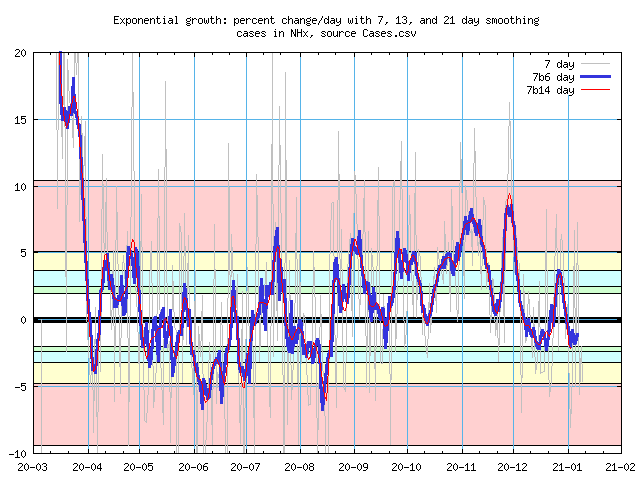
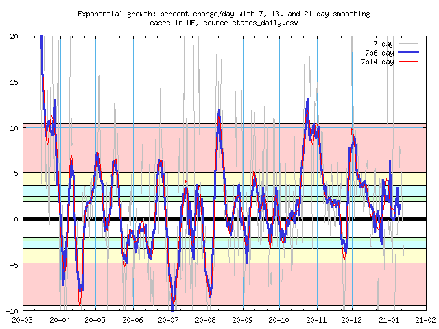
Pastel bands: Doubling time in weeks
Instead of a percentage change per day, it's easier to think about how long it takes for
the number of cases to double. For example, if half the ICU beds in a hospital are used
by Covid-19 patients, one doubling is how long it will be before they may all be in
use.
The pink band shows growth rates from one week (about 10%) to two weeks (5%). Yellow is the two week band, cyan and green show three or four weeks. Simlarly, the bands with negative growth rate represents the time to cut the cases by half.
I live in New Hampshire, the rest of the states are nearby.
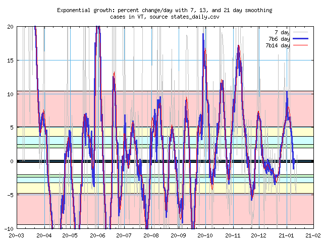
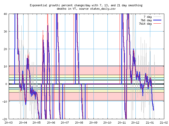
Vermont
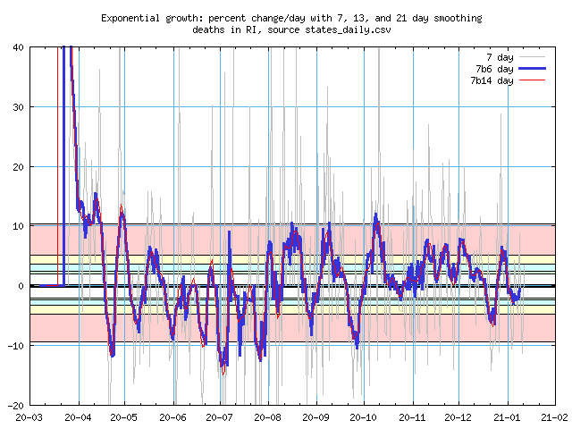
Low population states have a low case count, and small changes have a disproportionately
large response. The deaths graph has to deal with many days of zero reports. When a new
death is reported, the percentage increase is infinite, at least the first day of the
smoothed period. There's a similar downward spike for the 100% fall when we go back to
zero new deaths.
New Hampshire
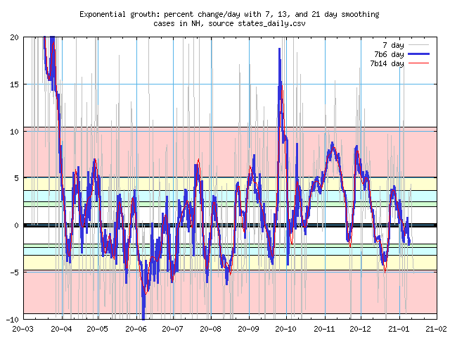
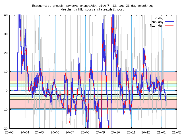
New Hampshire - locally maintained data
Delays in processing test results has led the state to update past data, data that
aggregators haven't picked up. Here are graphs from data maintained by Health and Human
Services. Annoyingly, DHHS isn't making daily death data available, only the average of
the week up to the report date. So this display is essentially triply smoothed with two
different weeks' averages.
These graphs aren't being updated automatically yet because I can't find a URL that goes to just the data.
Maine
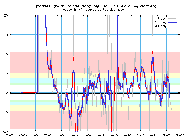
Massachusetts
Massachusetts reported -7,636 cases on September 3rd, it took three weeks to catch back
up. I don't know what that data point means, but my software did the best it could without
discarding it altogether. They also reported some 3,840 new cases on June 1st.
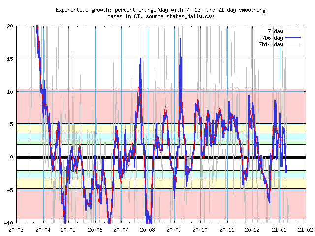
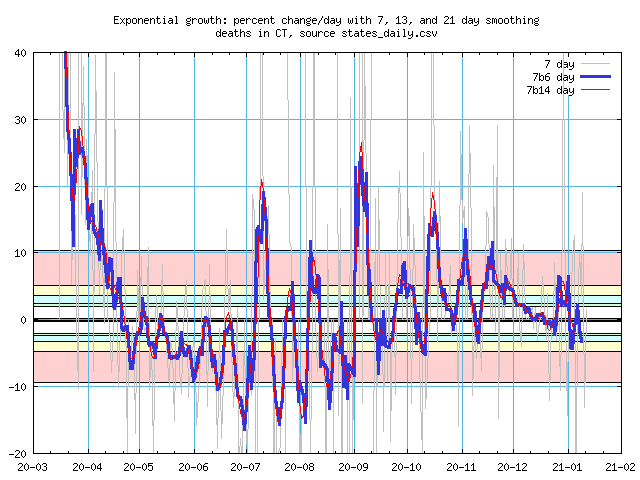
Connecticut
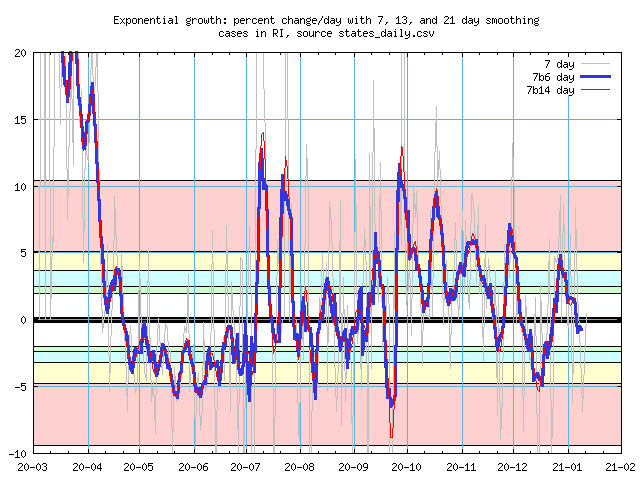
Rhode Island
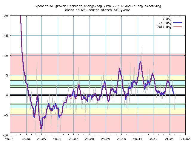
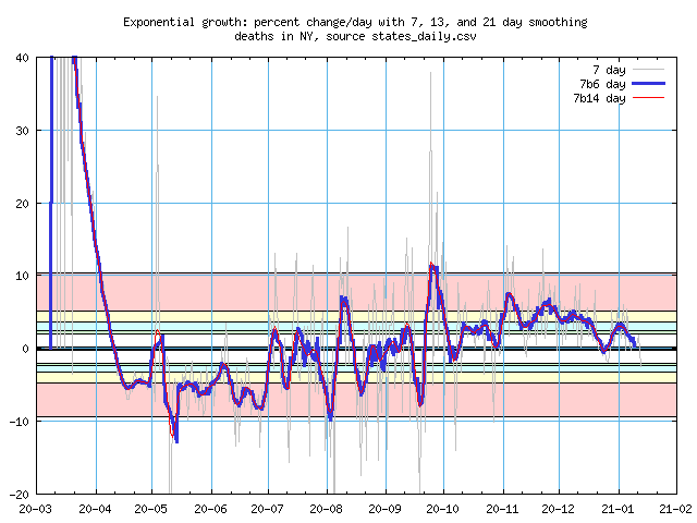
New York
The state, not the city. While they did a good job to lower the new case count in April,
May, and June, the period since late August has only a few contractions. Also, the data
in September and October looks a lot noisier. I haven't investigated.
My close relatives are in the west now.
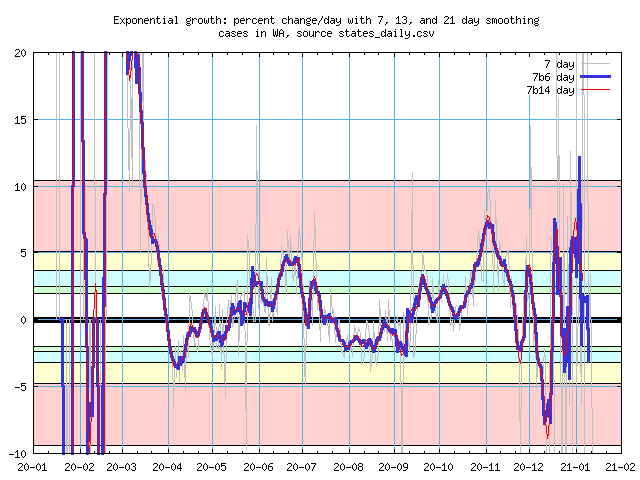
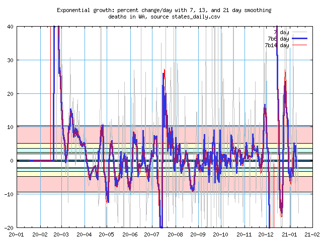
Washington
Both daughters are there.
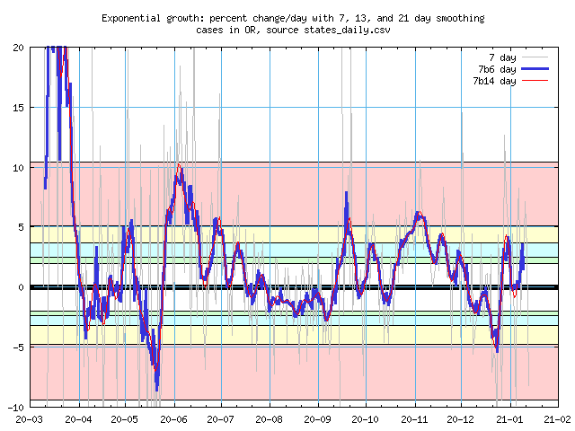
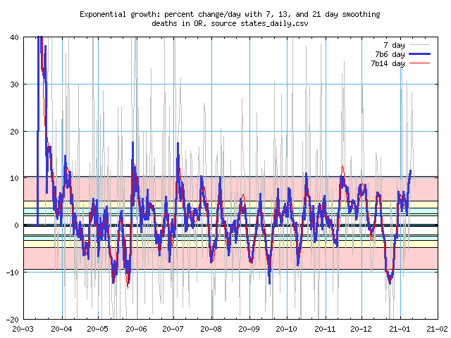
Oregon
My brother.
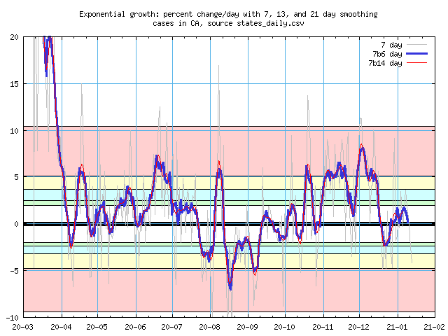
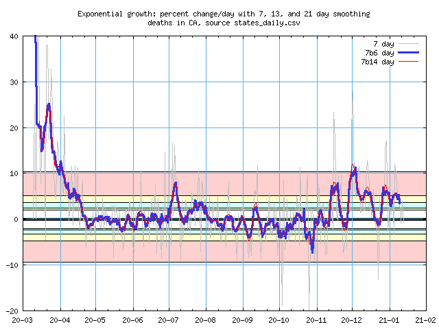
California
My sister.
Just a couple for now.
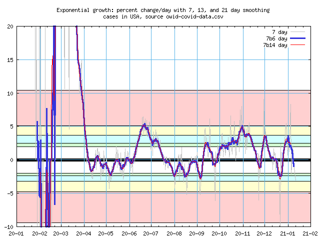
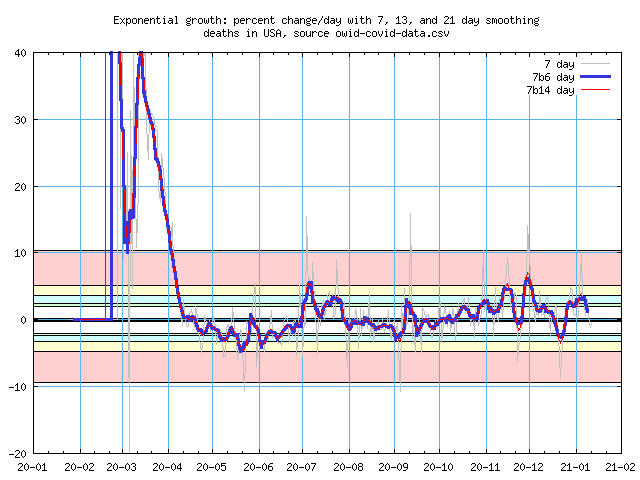
United States
We're Number One, but in various ways we'd rather not be leading the pack. A new reason
to watch out for #1.
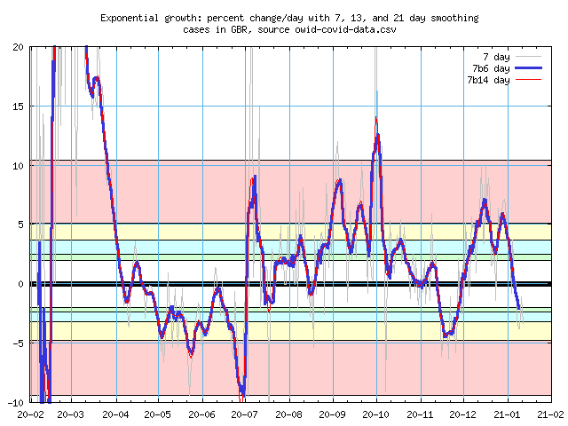
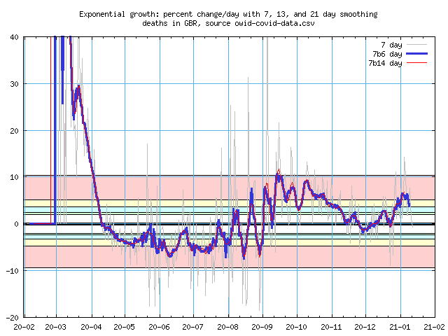
Great Britain
The big news from there is a new SARS-CoV-2 strain that is some 70% more infectious (there
are some concerns about the math behind that). So here's their data to see if that picks
up on a increase (new strain) or decrease (new restrictions) in their case rate.
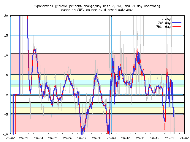
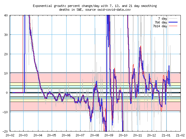
Sweden
Sweden is held up as a shining example of what a country can do without invoking a
lockdown. Sometimes maybe yes, sometimes maybe no, some other reasons too. I think
everyone who touts Sweden as good example hasn't bothered to look at the other
Scandinavian countries - they're all doing much better than Sweden. It's here because
they report data only once or twice a week and I wanted to see how my software would
handle it.
I use the Covid Tracking Project for nearly all state data. While the folks there try to include updates to previous days' data, they aren't doing it well for New Hampshire. For NH, I haven't found a good URL to "scrape" from their site, so I manually download data from the NH Covid-19 dashboard.
For country data, I use a link from Our World in Data.
My programming career has been mostly spent working deep inside operating systems. Instead of translating formulae, we deal with data management, cooperating processes, uncooperative processes(!), and a whole bunch of peripherals that ultimately do things on their schedule, not ours. Once in a while I'd come up to user level and abuse numbers, and I do have a good science background, so this shouldn't be too hard. I knew it wouldn't be easy, and there's no "right" way to implement "Oh, just take an average." I did have a good idea of what I wanted to do and why.
The first issue is that various states and countries have a observe weekends and other days off even though viruses do not. For example, confirmed cases are a lot less likely to be reported on Sunday, and Monday often reports more than the average. While I thought about scaling the reported numbers by the typical weekly pattern, it would require figuring out the pattern for each state, and then look for changes in it. The simplest and safest thing to do is make an unweighted average of a seven day window. I.e. for every case on say, the 16th, count it as 1/7 a case for each day from the 13th to 19th. That way, each resulting data point will have 1/7th of a Sunday and 1/7th of a Monday. There's a bit of a problem during surges - if that Monday number is the first day in the window, then Sunday will be the last and won't have the pair we'd rather have together. I can live with that.
Note that if you had a 7-faced die labeled with the names of the days of a week many times, you'll wind up about the same number of occurances of each day. [An aside: if a mathematician points out that there's no Platonic solid with seven faces, just show him the rod an engineering friend gave you with a septagon for a cross section. Refer to it as a "septagonal prism."]
You see a similar effect with rolling a standard 6-sided die. If you rolled two of them and added the spots together, you'll see that 2 and 12 come up rarely and that 7 is the most common. That's because there are 36 outcomes from rolling two dice - one of them scores a 2, one of them scores a 12, and six of them score that 7. Back to Covid case counts, that one week flat average is a big help, but the WHO recommends people do a two week average to further reduce the noise. However, I wanted to play with weighted averages. A problem with the Who's recommendation is that if there was some event, like adding all the cases from another group on one day, 15 days later you'll see the average drop and you'll puzzle over what that means until you remember that one-off event.A weighted average improves on that - By emphasizing the counts for the days in the middle of the window and demphasizing the more distant events we can change that rectangular conversion into something better. That pair of dice does that - it creates a triangular mapping instead. For a six day week those numbers, in 36ths, are 1, 2, 3, 4, 5, 6, 5, 4, 3, 2, 1. For our seven day week, we would use (in 1/49ths) 1, 2, 3, ..., 5, 6, 7, 6, 5, ...,3, 2, 1. A cute trick for doing this is simply apply that seven day average twice. EEs call this process "convolution," though we generally convolve one long signal with a shorter one. We're happy to do it multiple times.
Being a sucker for cute tricks, I went off and did that. That one week flat average is actually one convolution and removes the Sunday effect, a second convolution makes a weighted average spread over 13 days (not 14!). I could even do it a third time for a 19 day weighted average. What's really neat is each new round gives you a mapping close to Gauss's Bell Curve.
Except.... It wasn't until I graphed the 19 day average that I noticed the middle part of the mapping was flatter than I expected. It turns out that third convolution wasn't working with the whole 13 day map, but only 7 days in each step and I needed to use all 13 to get closer to the Gaussian map. Well, if I did that, I'd have a 25 average, longer than I wanted. What if I used a shorter map, e.g. a triangle map only 11 days long, as that would give me a 21 day result by doing that convolution twice. That's good, I'd have averages for 1, 2 (almost), and 3 weeks. Yay.
I sat down yesterday to write up all this and suddenly realized that my 11 day map was based on a 6 day average, and that meant it wasn't smoothing out that weekend data! So much for that cute trick. Sigh.
That Gaussian curve pops up in all sorts of other places. One of the very best is in Pascal's Triangle, a list of coefficients to the terms in (a + b)^n, where n is an integer starting at 0:
  n
  0                    1
  1                 1     1
  2              1     2     1
  3           1     3     3     1
  4        1     4     6     4     1
  5     1     5    10    10     5     1
  6  1     6    15    20    15     6     1
If you plot these, they'll quickly aproximate a Gaussian curve, Pascal's Triangle inspired the derivation of the formula for the curve. So this is another cute solution. In fact, it's much better, as I can choose any number of days to convolve with the 7 day average. The n = 6 above is good, as that will give me a 13 day window. n = 14 appears to be another good one, as it gives me 3 weeks. In that case the first and last couple of days have such little impact on the average, I should either discount them, or choose a map that will give me a more meaningful 21 day window.
Why not just use the formula? One reason is that it's a continuous function, so I'd either have to pick out a point or average over the relevant range. The equation includes the standard deviation (a function of the distance from the center of the triangle), pi, and e (Euler's number). On the other hand, I can create a line of the triangle with this (cute) Python code:
    def binom(order):
        term = 1
        result = [ term ]
        for cell in range(order):
            term = (term * (order - cell)) / (cell + 1)
            result.append(term)
        return l
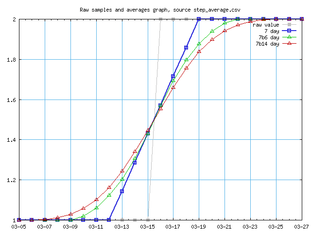
This turns out to work pretty well, next time I'll start there. Graphically, here's the effect of the 7, 13, and 21 day averaging. The first graph shows a case count of 1 for all days except for a 2 in the middle. The 2 goes off the scale, the 7 day average is 1/7 for each of those days, and the longer term averages show a nice bell curve shape. The second graph shows what happens with a new case that hangs around for a while, i.e going from one case to two and staying there.
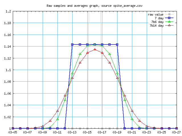
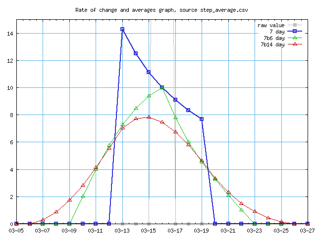
We're not done yet. The Covid data here is based on the rate of change, not just the new cases or death per day, but the ratio between one day and the next. If things are stable, the ratio will be one, but if cases are increasing, then the ratio will be greater than one. Applying this to the second graph above, we kinda, sorta recover characteristics of the first graph. When the number of new cases from day to day is one (or two) per day, the ratio is 1 per day. However, that rectangular 7 day average is no longer a rectangle. Each day we add that 1/7 case, or 0.14 case. The first day goes from 1 to 1.14, obviously the ratio 1.14. The next has the count going form 1.14 to 1.28, or 8/7ths to 9/7ths, and the ratio falls to 9/8, or 1.125. The top of the rectangle is now part of a hyperbola.
For real data, we don't see 100% jumps and the hyperbola isn't as pronouced. Ultimately, most of this exercise doesn't matter all that much anyway and my results aren't all that different from a straight average. However, it makes the mathematician side of me happy. The engineer part will be happier when I deal with the low impact tails of the 21 day average, either to get that average to extend closer to the end date of the graph or widen it and have a meaningful 21 day average.
Other stuff to work on:
Maybe graphs with the cumulative data.
More states and countries.
Break into several pages, especially moving the discussion about averaging out of the main page.
Written 2020 Dec 26, text last updated 2020 Jan 10.